Business owners who want to learn more about the importance of accessibility on their websites.
Let’s start with a story…
It’s yet another wintery morning. You wake up, you go by the window, and ta-da! All is white, snowflakes are falling from the sky, so you start thinking: ‘Is this a good day for skiing, or what?’. And off you go to the ski slope like there is no tomorrow.
A couple of hours later:
You are not skiing, enjoying life. You’re at the hospital with one broken hand and a black eye from the tree you hugged earlier. Your medical leave covers only a few free days. You need to use your computer to work and you would like to post online your latest life happenings. But you cannot see clearly and you cannot use your hands at all. You can’t even take a picture with your phone.
Now… Do you think that a zoom tool might help you during the next couple of weeks? Or maybe a screen-reading software would come in handy to complete your tasks? If you’re not sure what the right answer might be, then keep reading.
Basically, it all comes down to:
ACCESSIBILITY – it’s like the ramp entrance in front of a building. If you don’t need it, you hardly notice it. But if you do, it’s the difference between being welcomed in or being locked out. At least this is what the Conversion Rate Experts state in their very well-written article on the subject.
So let’s dig in:
Why should you use Accessibility in your design?
As noticed from the ski trip story shared above, anybody can experience moments of impairedness. Ensuring our designs are accessible is something that would help way more people than we expect.
Let’s put aside the fact that accessible design can be beneficial to everyone. Let’s focus instead on people with a life-long disability. In Europe alone, there are about 80 million disabled individuals at the moment and only 10% of the European websites are accessible to them.
Why? Because businesses don’t focus on accessibility. Why? Because they think that only a very small fraction of their target users will benefit from it.
Wrong! Check out this article for more information. By designing a product with accessibility in mind, you allow users with a variety of abilities to navigate, understand, and use that product.
Benefits of Accessibility
With that in mind let’s take a closer look at the benefits of implementing accessibility for your business.
1. Accessibility improves everyone’s user experience
Accessibility brings enormous improvements for all users. Aiming to make products accessible to as many people as possible should not be seen as a problem or as an additional effort at all.
A designer’s job is to ensure anybody can easily understand and use their designs. Knowing this, it’s vital that they take into account permanent, temporary, or situational disabilities while crafting a new design.
For example, while designs should easily accommodate people with a permanent disability such as hearing, vision, or smell loss, they should also be accessible to someone with a temporary impairment, such as a broken arm. As long as this part is integrated into the planning phase from the first moment they start working on a design, making that design accessible won’t feel like extra work.
Think about video captions. They can make videos legible for people watching them on mute. Yet, they are vital for people who have a permanent hearing disability. Or, think of a bright screen. Brightness can help someone who needs to look at their phone in the middle of the day. Furthermore, it is also helpful to someone who cannot see properly.
As a result of demanding contexts, users will encounter challenges. If you have a design that fits all abilities, you can deliver products and services that anyone can enjoy.
2. Accessibility increases sales
By improving the user experience with accessibility in mind, you lay the foundation for the overall success of a product or service. Accessibility issues provide a business the chance to connect with a bigger, maybe untapped client group.
It is usually easier for companies to act if they see a strong financial benefit, which is why accessibility is a strong argument. Although only a small percentage of the visitors of a website might be blind, many might have a low vision. So, it is likely that profits will increase if you follow guidelines for low-vision people, since anyone can be occasionally visually impaired.
Bottom line, improving accessibility leads to usability, and usability leads to higher profits.
3. Accessibility has rules and regulations that will help you (if you know them)
In October 2019, Guillermo Robles, a blind man who was unable to order food from Domino’s Pizza’s website and mobile app, sued the chain. The reason invoked was that they didn’t provide screen-reading software.
The U.S. Supreme Court ruled in favour of the plaintiff. They said that ”any digital platform which is tied to a physical location providing goods or services should also comply with accessibility standards’. You can find more information on the subject here.
Now, according to the EU Web accessibility directive, a website in the public sector has to be accessible. And mobile apps have to follow the WCAG 2.1 level AA standard. Although the EU web accessibility laws and the European accessibility act aren’t laws, but directives that govern public accommodation, each state can interpret the directive in any way they think is best. So be careful, a precedent is always an ice-breaker.
How to check if your site or app is accessible
Here are just a few ways to see if you are doing the right thing or you need to focus more on accessibility.
- Check the contrast ratio. It is very important not to use bright contrasting colours. See WCAG Visual Contrast website for more information or use this tool to check the contrast used on your application.
- Check alt text for images – A simple way to do this by using a screen reader like Talkback, VoiceOver or NVDA.
- Check if the zoom tool works. Make sure your site does not lose any important content when zooming in or out.
- Visualise your site’s accessibility with assistive technology by using tota11y. See more here.
How does Evozon implement accessibility in its projects
1. Error messages are not based on colour only, they are specific and easy to read
It’s easier to understand error messages if they have both the word Error and a very specific icon that indicates the fact there is a problem with the action taken by the user. The colour is just a plus for enhancing the idea of an error occurring. This is very helpful for the people who are visually impaired.
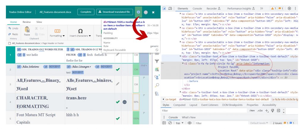
2. Aria-labels were added for buttons with no text
Below we can see that the “i” icon has an aria label which explains what the letter “i” stands for – Information Project. This is very helpful for the users who use a special hardware which reads the DOM.
3. Images have descriptive alt-text
People with visual impairments and those who use assistive technologies such as screen readers can use alt-text to provide essential information about the content and purpose of an image.
Alt-text is very important for people using screen-readers as they will not be able to get the information from the images if there is no text assigned to them.
You can read more about how alt-text should be used here.
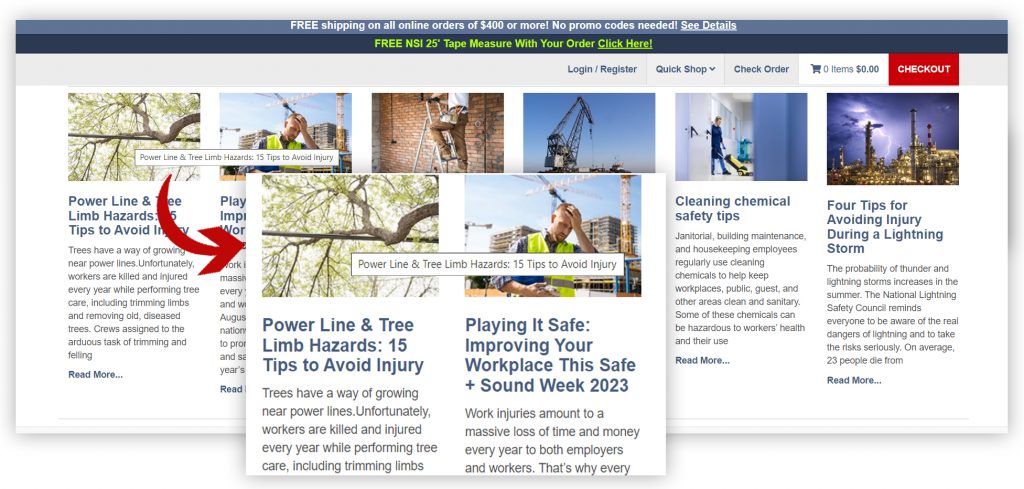
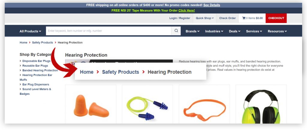
4. Breadcrumb navigation
Breadcrumbs enhance navigation and orientation for all users, particularly those with disabilities or impairments that may affect their ability to browse websites or applications effectively.
Furthermore, breadcrumbs help users understand the structure of the website and their current location relative to the homepage.
For example, users with motor disabilities may find it challenging to use a mouse, so they navigate websites only using keyboard inputs.
By using breadcrumbs, you can quickly navigate back to higher levels of the site structure without having to repeatedly click “Back”.
You can see below how Würth uses breadcrumbs to facilitate easier navigation for its users.
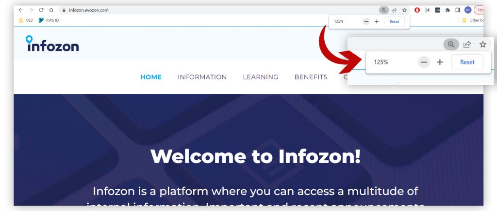
5. Text can be magnified by 200%
Incorporating text magnification features is a straightforward way to enhance the accessibility of digital content.
Why?
- It allows users with visual impairments or low vision to enlarge the text to a size that is comfortable and readable for them.
- It demonstrates a commitment to inclusivity and diversity by making information more accessible to a broader audience.
Infozon provides such a tool as we can see in the images below:
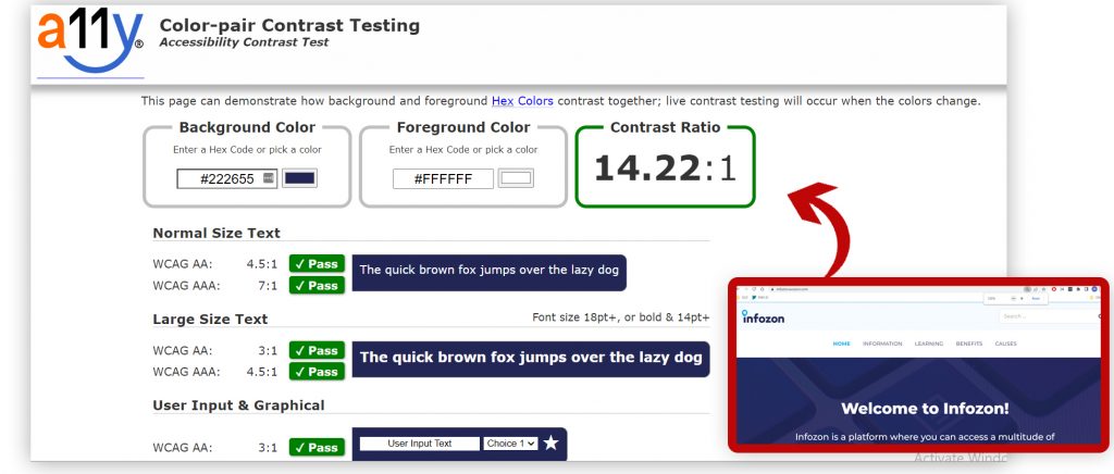
6. Small text has a contrast ratio of at least 4.5:1 & large text has a contrast ratio of at least 3:1
As an accessibility factor, contrast ratio has a significant impact on the readability and usability of the content for all users.
This includes:
- people with visual impairments
- colour blindness
- ageing population
- people that are colour blind
As part of the Web Content Accessibility Guidelines (WCAG), the World Wide Web Consortium (W3C) recommends certain contrast ratios for text and other visual elements. A ratio of 4.5:1 is commonly used for normal text, and a ratio of 3:1 is used for large text and user interface components.
Thus, in the context of inclusive web design, meeting these contrast requirements enables web designers and developers to create accessible and enjoyable websites for a wide audience of people with disabilities and abilities.
We can see in the example below how by using the contrast checker mentioned above, the foreground and background colours are in concordance with the specified guidelines.
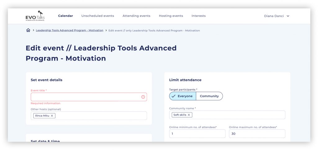
7. Text hierarchy & clear labels
For web accessibility, it is imperative to have a clear hierarchy and labelling of text. This improves user experience and aids all users in understanding and navigating content.
Individuals with conditions such as dyslexia, ADHD, or cognitive processing disorders rely on well-structured and easily comprehensible text to navigate through a website. They also need proper text hierarchy to ensure that screen readers can understand the content’s structure accurately. This makes navigation and comprehension smoother.
Clear labels are also essential for keyboard-only users, as they rely on keyboard navigation to interact with websites.
Websites that are easy to navigate and understand tend to have higher user engagement and conversion rates. When users can quickly locate the information they’re looking for, they are more likely to stay on the site and complete desired actions.
As seen in the example below, the EvoTalks Editing an event page has clear labels for each section and also the text hierarchy is very well established – Title, label, normal text.
Conclusion
To sum things up, your service or product will not be inclusive unless you consider the needs of all the people who will use it. By taking everyone into consideration, you’ll increase the chances of them taking you and your product into consideration as well. It’s a win-win situation. Just think about it while recovering from that horrid winter Sunday morning (remember the skiing accident from the beginning?).