The homepage is the most important page in any website, as it is the first page users interact with, when in the process of buying a product. For this reason, creating the homepage requires a lot of attention. Who are you, what are you selling and why should I buy from your online store? If a user doesn’t get answers to these questions in the first 5 seconds, the chances of spending more time on your website decrease dramatically.
In case you’ve installed Google Analytics on your e-commerce, a metric you must check constantly is the bounce rate (the percentage of visitors who navigate away from the site after viewing only one page). If its value overcomes 60%, make sure your website gives fast answers to the questions above. Otherwise, there’s a chance your visitors didn’t acknowledge that your store addresses their needs.
We will explore in depth the basic elements and questions you need to answer when creating a homepage:
1. Who are you?
On top of the page, above the menu, make sure to include:
- logo/name/visual representation of your brand
- motto/tagline
- phone number
- e-mail address
- links to the store’s social media pages. The more likes your social pages get, the more credibility is associated with your website, especially if it is an active page on a social media network, where answers are given to users’ questions. If your page has under 300 likes we suggest you postpone revealing the number of likes for the moment.
2. What does your website sell?
You must present on the homepage the products or main categories of products available for sale. At the same time, it is mandatory to make visible the “Buy” or “Add to cart” button. It’s mandatory in order to clearly indicate that it is an online store and that the user is there for that purpose. Additionally, the presence of a “shopping cart” in the form of an image/icon at the top of the page will attract attention towards the possibility of acquiring products/services.
3. Why should one buy from your website?
Lately, in Romania, a lot of e-commerce shops appear overnight, which may or may not be real. You need to reassure your visitors that they can rely on your products. That is why it is important to display in a strategic place the following elements:
- trusted brands (e.g. from www.trusted.ro)
- safety banners (which usually refer to the Return policy, Free shipping, 24/7 customer support, opening the package on delivery, company’s phone number, customer service, real reviews of products).
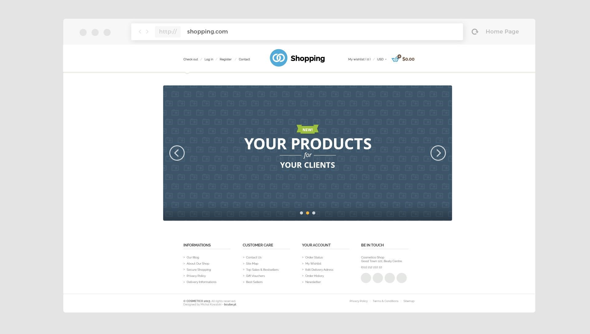
4. To have or not to have a slider?
A study conducted by Notre Dame University revealed that only 1% of users click on a slider and 84% of them interact just with the first banner. Statistically speaking, other than the first slide, the rest of the banners do not benefit from the desired attention to make it worth introducing them in the slider. The safest thing to do is to test on your own website if a slider is successful or not. You can find out in Google Analytics how many users interact with the banners. If the click-through rate is high in relation to the number of users, then the slider is a useful presentation instrument and is worth updating. If you reach the conclusion that visitors do not interact with it, it would be useful to think of alternative displays of products.
Some alternatives could be:
- Campaign presentation banner
- Promotions
- Product of the week
- Product for which you want to start a campaign of stock clearance
- Launching one or multiple new products.
Don’t forget: each image, static or part of a slider, must contain a “Call-to-action”. These could vary from messages like “Buy now” or “See more” to “Details” etc.
5. The “New Products” area
This section is dedicated to users who come back on the website and want to see what products have been added lately. In the same time, it shows that the website is constantly updated and relevant in its field. Most people who already love your website and buy often, already know your products and are interested in whatever is new. For example, in fashion you could present a new collection or in electronics you could present the latest products available on the market. You should display a selection of products as varied as possible! Most businesses present on their homepage only a certain type of products, which they believe to be of interest or efficient. They don’t realize that when a new user enters the website, he should find the product he wants or at least the category that it belongs to, not the business’s preferences.
6. Partners / Clients
If you are collaborating or selling the products of renowned brands in the industry, don’t hesitate to create a section that will include the logos of the most important partners. Additionally, if you offer certain services, include a section dedicated to display your clients, either with logos or testimonials. This section will add value and trust to your products / services and demonstrates the truthfulness of the content of your website.
Last, but not least, choose a loose design. For an e-commerce website, the stars are the products and in order to highlight them you will need to use colors. If you use colors that are too striking or too many, that product will fade. Most e-commerce shops try to keep their website as simple as possible, with considerable spacing and alignment between the elements, so as to help the users to easily navigate through the website. Don’t overload your page with too much text. Text is important from a qualitative and quantitative point of view for search engine optimization, but it shouldn’t appear on the homepage. Don’t waste space which can be used towards an offer, with a company description. Products occupy the first place in the display hierarchy.
Invest time in creating an attractive online store and you will obtain positive results for sure!
eCommerce Team