With the advancement of technology, the software market has grown considerably. Additionally, a lot of software products today are similar to one another. One reason for this is that products are produced and launched in a hurried manner. This usually happens by neglecting the needs of the users and the importance of focusing on usability as a key aspect of a product. This is why more and more companies resort to usability specialists. Their jobs revolve around tweaking products in order to make the most out of their strong points and improving their weak points, making the user’s experience better.
Although at first glance this might seem simple, usability improvement is quite complex. As with many of the tasks of usability testers, what is visible to outsiders is merely the tip of the iceberg. And they are often the only ones who know the theoretical aspects that lie beyond these activities.
The tester often resorts to going beyond the standard procedure and comes up with custom-tailored solutions for every website and software product. This happens despite the usage of a checklist to track the usability testing goals. Individualized analyses of these products are used to achieve this. The reason is to determine precisely what the priorities are in improving their usability.
Content processing
One of the fields that can be successfully applied to usability testing is neuroscience. It can be used in conducting long-term analyses of what a website’s usability would pose. In order to explain this better, take the following example: the left hemisphere of the brain controls language and text-processing skills and abilities (for over 97% of people), whereas the right hemisphere primarily controls visual processing (such as images and videos).
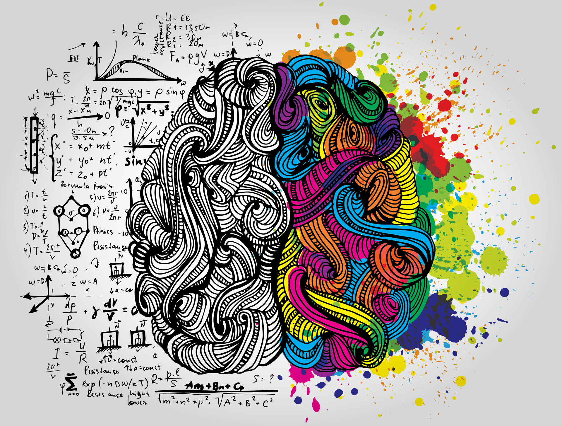
This is one of the reasons why it is desirable to have the text on a website aligned left, and not justified, or aligned right. The latter only being preferable with Arabic and other languages that read from the right to the left, in which the cultural context dictates the rules. Thus, by adopting the left alignment, the text is easier for the brain to read, process, and understand.
Using patterns and offering information the right way
Organizing a website in a pattern is essential for ensuring effective navigation for the user. Patterns activate predictions and stimulate neurones (e.g. stimulates dopamine, one of the main neurotransmitters). This way the user finds it easier to improve their experiences. As explained by Schultz, a physician who explored the human brain in the 70s, “if everything goes according to plan, its dopamine neurones secrete a little burst of enjoyment” (How we decide, Johan Lehler, p. 7).
The application of color and titles to a website is another example of how neuroscience may explain usability testing. The better these elements are used for handing out information to the user, the more that user will become attracted to a website, product, or brand. Furthermore, good use of colors and words will make users associate certain phrases or symbols with a brand or an idea, while at the same time ensuring adequate navigation possibilities on a website. Users often feel the need to get most of the information they desire from the main page of a website. This translates into a feeling of control. By fostering this feeling, we can encourage the loyalty and attachment of the users towards a particular product.
Using colors as tools for better user experiences
The way we respond to colors and how we associate them with emotions are two things that require complex brain activity. These issues are also linked to the cultural norms of the user. This is an important element for the usability tester to consider. For instance, if we analyze the color white, in the West, it means purity and peace. In the Far East, white symbolizes death and mourning, while in India it means unhappiness. This is one example that reflects the importance of paying attention to culture. This especially happens if we take into consideration the fact that brands are constructed using chromatic elements. When it comes to website navigation and sales, colors can affect a variety of factors. So, it’s important to master them accordingly.
These are just a few examples of how the brain plays a role in the many usability processes. Therefore, it’s very important to go deeper than surface testing on a website and to try to understand the user. A neuroscience perspective is a good start when trying to improve usability testing. It will help everyone understand, apply, and customize each piece to their own situation.
Andreea Popescu